Eastern charts forecasting market reversal or consolidation in Bitcoin

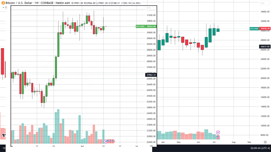
Utilizing the most popular kind of Japanese chart, the candlestick chart we can gather different findings when using different times scales. On a weekly chart we are forming are third doji candlestick, A doji candle is drawn when the opening and closing prices are the same or very close, its appearance represents a pivot point (like from bullish to bearish) or a point of consolidation in the market. The daily candlestick chart says the exact same thing with the last three candles being doji (the candle for 7/11 is still forming).
A Heikin Ashi chart or Japanese average chart drawn with the start of the candle is drawn from the close of the prior candle instead of the opening price. This charting style is great for determining the strength of a trend. The daily chart is too noisy and does not give us much information but the weekly Heikin Ashi tells us that the current rally is running out of steam as shown by the diminishing body size over the last three weeks.
Eastern charts that do not include time as a variable
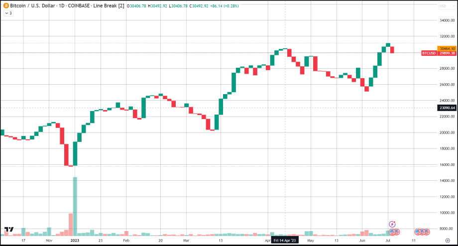
Some Japanese charts do not include the use of time when drawing new candles, the x-axis does have a time scale although in these charts I am about to cover a new line or brick or block is only drawn in when a significant price change occurs and the change is only based on the closing price. As such each new candle or line could take any number of days before being drawn like in the line break chart. Line break charts do not have any wicks and new candles are only formed when the price moves outside of the previous block. This type of chart can condense a large swath of time down to only the essential moves and can filter out a lot of noise. A line break chart can be altered by the number of lines needed to break in the other direction before a line goes from a prediction to an actual block. In this example below we are utilizing a two-line break chart meaning that a block will not be drawn until it breaks above or below the previous two blocks. On our daily two-line break chart, we have our first official break drawn as a red block forecasting a price decline. On a weekly two-line break chart, we have yet to see a price break although the current green block or candle is very small in size.
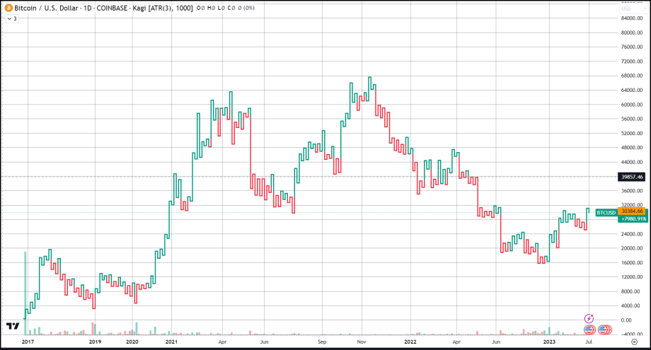
Similarly, in a Kagi chart the reversal amount does not need to be a fixed amount and only takes the closing price into consideration. It can also be based on Average True Range (ATR), which means the reversal amount will change as volatility changes. On our Kagi chart below we have the box assignment set on ATR and the ATR has a length of 3 or 3 days on our daily chart. As you can tell by the chart the line is facing downward meaning the closing price is lower than the last but it is not yet red because the price drop only overshadows the last 2 closes rather than 3 which we specified in our settings. The daily Kagi chart is hinting at a possible downturn but until we get our third lower closing price, we are not given confirmation by the line changing color.


